First Financial CU
Website Design Project | 2016
-
Website Design | Responsive Design | Internal Imagery Library | WCAG 2.0 Level AA Conformance
-
Bootstrap Grid | Sitefinity CMS


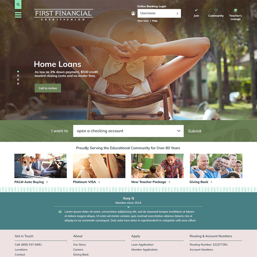
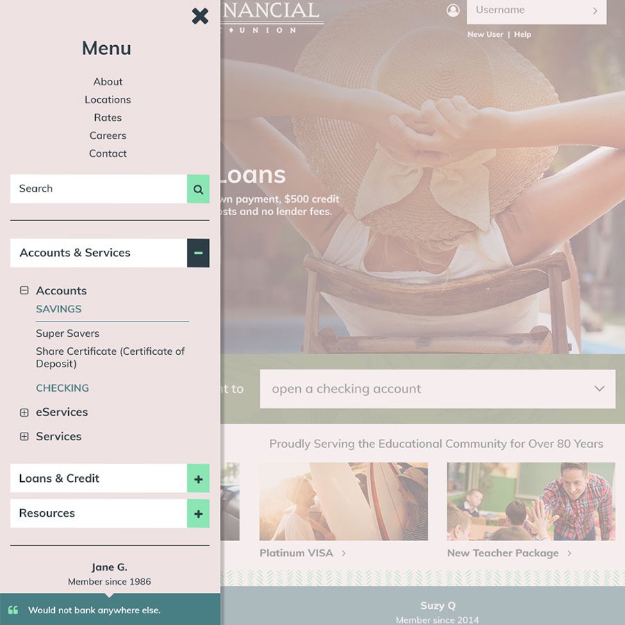
We believed this client needed a modern, innovative site, and we used a mobile menu on desktop to achieve it. This not only cleaned up the header area but engaged users immediately with full-width imagery. Since a lot of the client’s members work in education, we wanted the imagery to capture the spirit of teachers who are off for the summer.
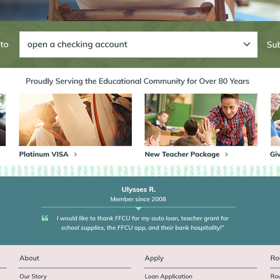
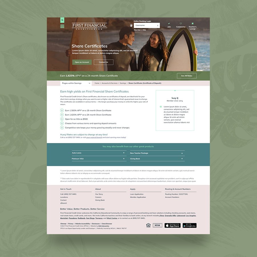
California style was the focus here with tropic patterns and colors to expand the brand of a credit union based in the Golden State. I wanted to create a color palette that was a bit different and very modern, pairing hues of tropical greens and a pastel mauve. The client ultimately chose a deep plum color as their secondary palette, to be used in backgrounds and text headings. I am still proud of my initial design, though, and love the pastel palette.
